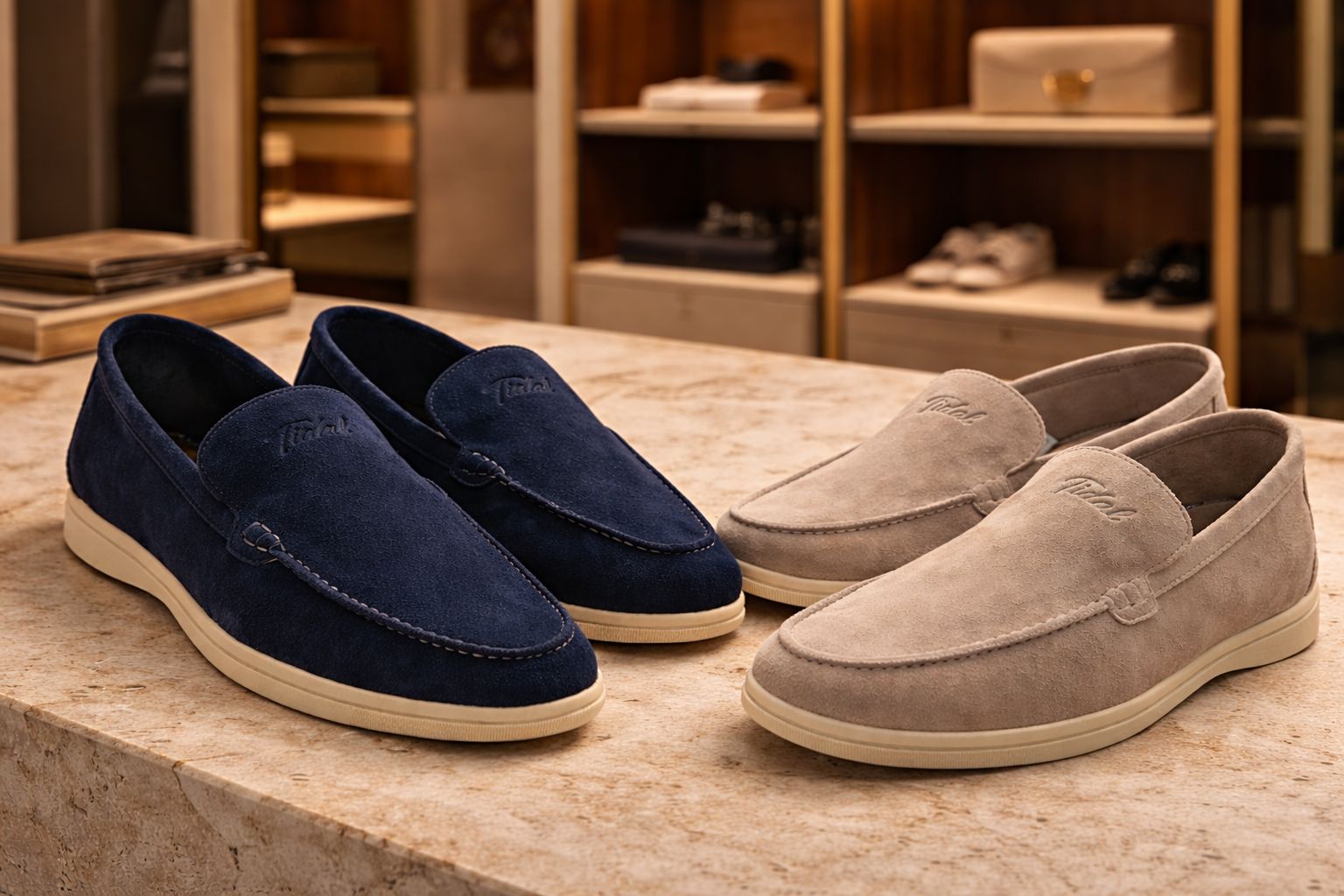
Shop by style
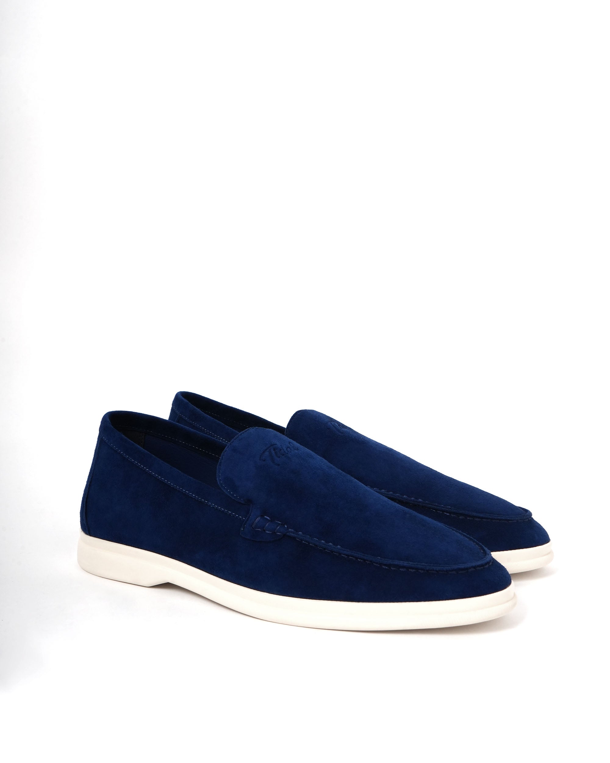
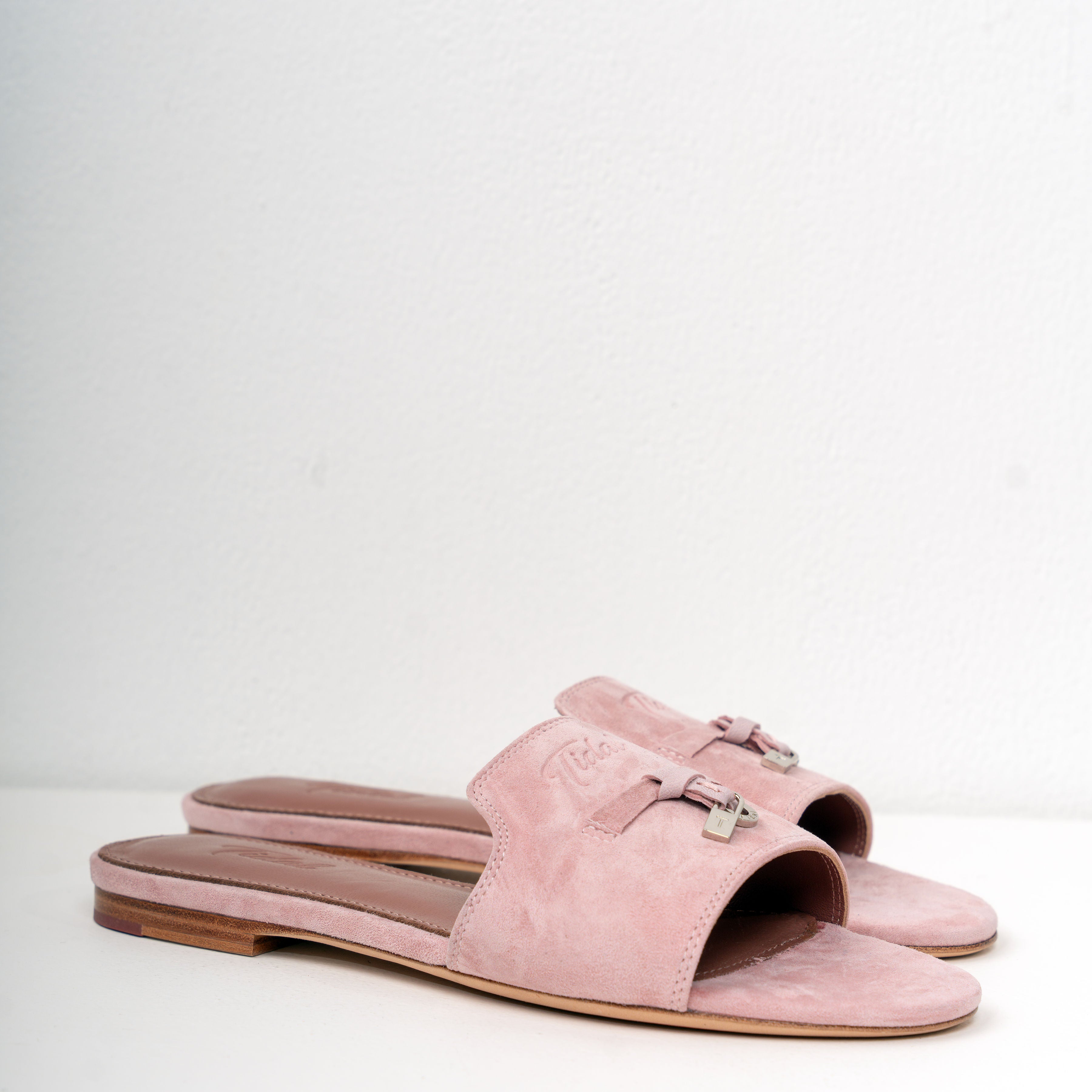
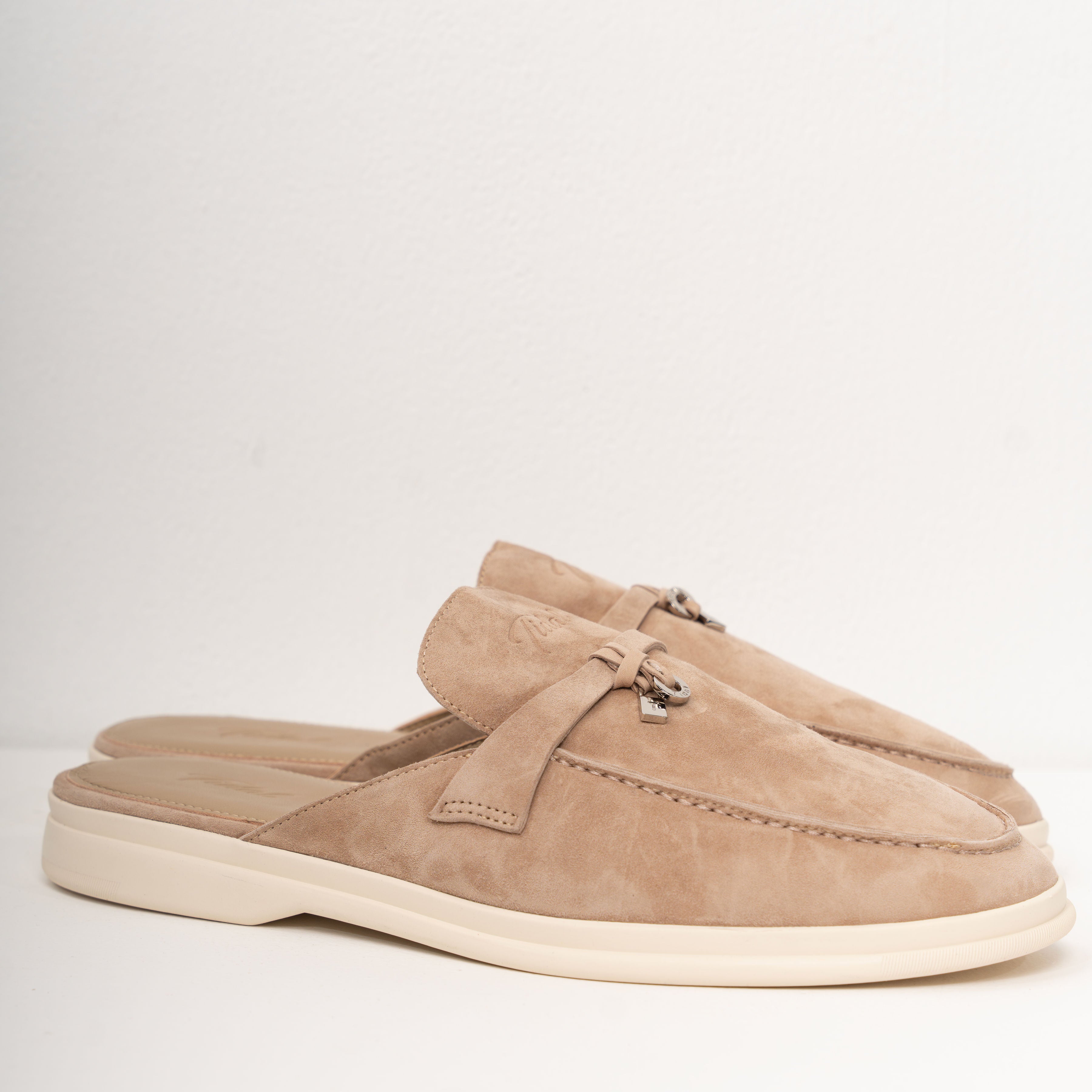
What's new today
New Arrivals
The pairs that just landed from the atelier — small batches, retired once they sell through.
Shop new in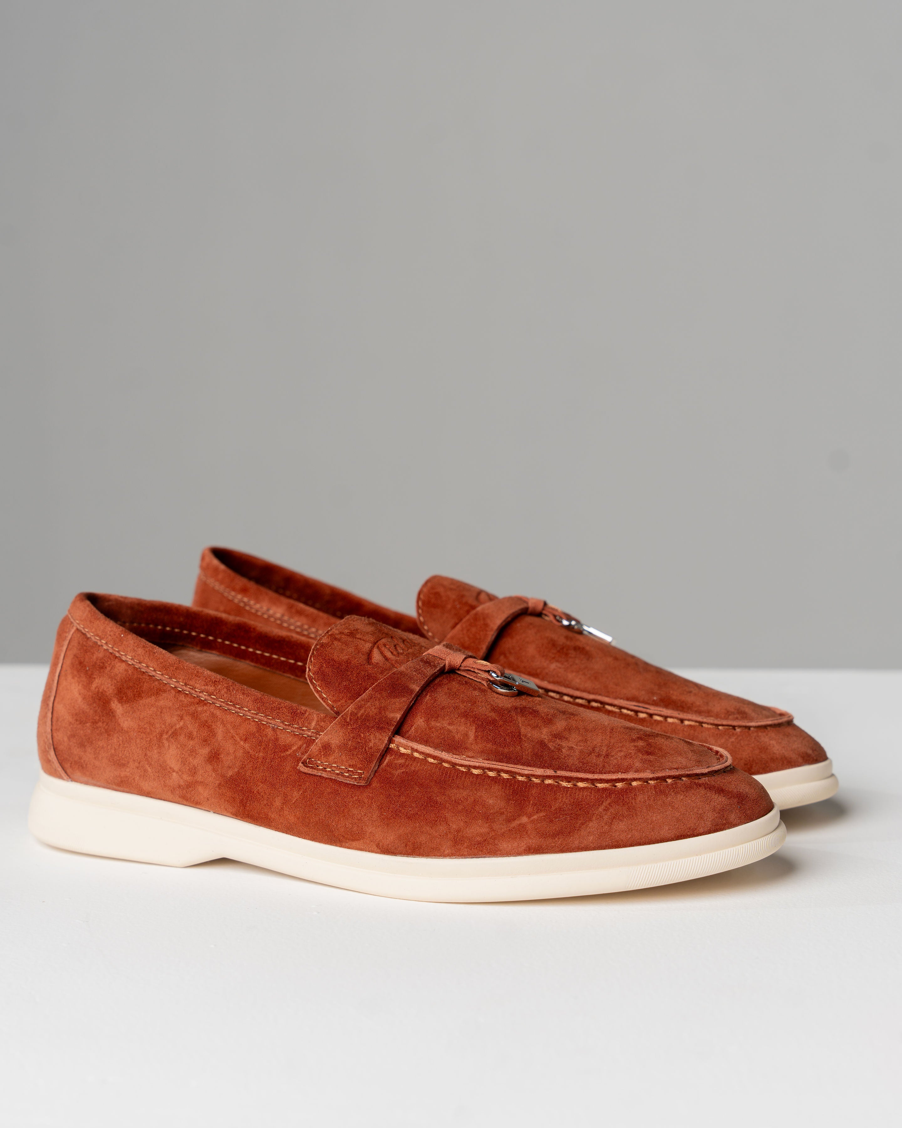
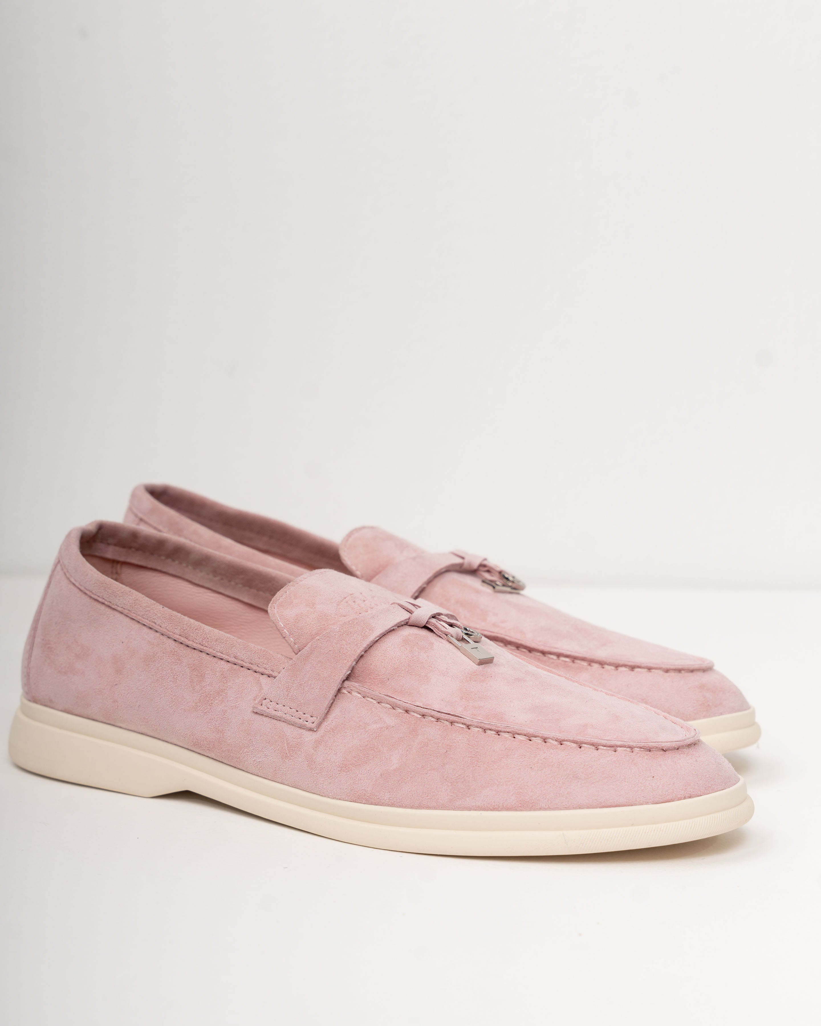
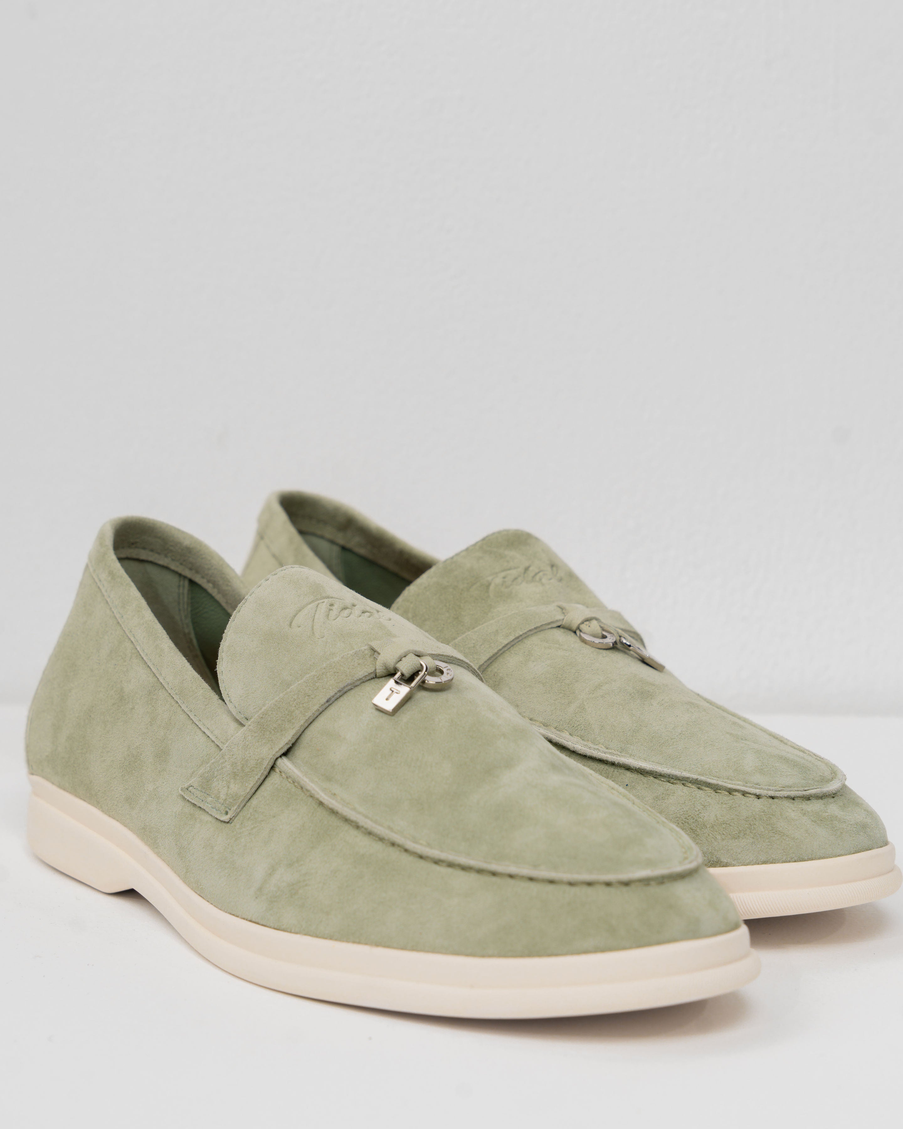
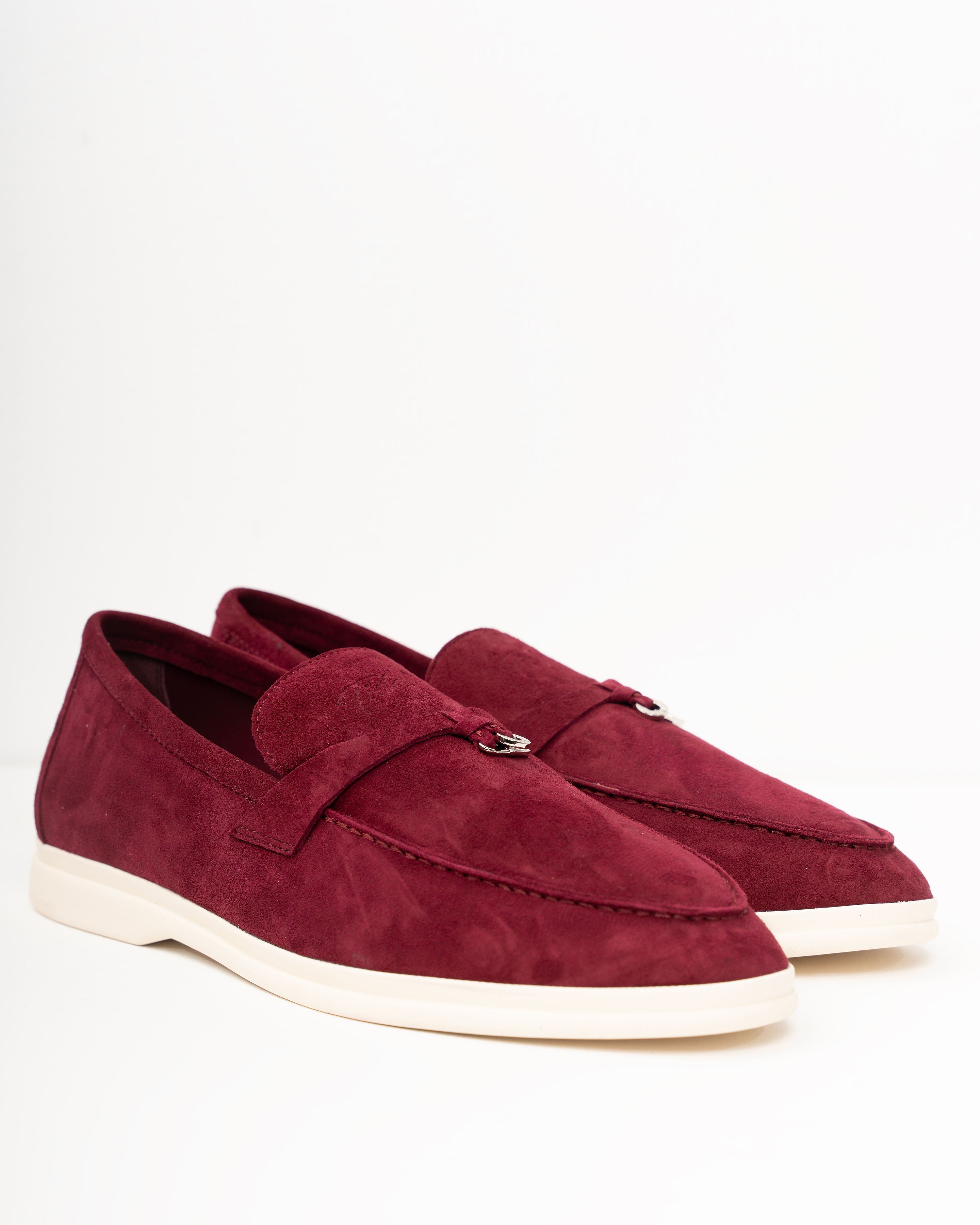
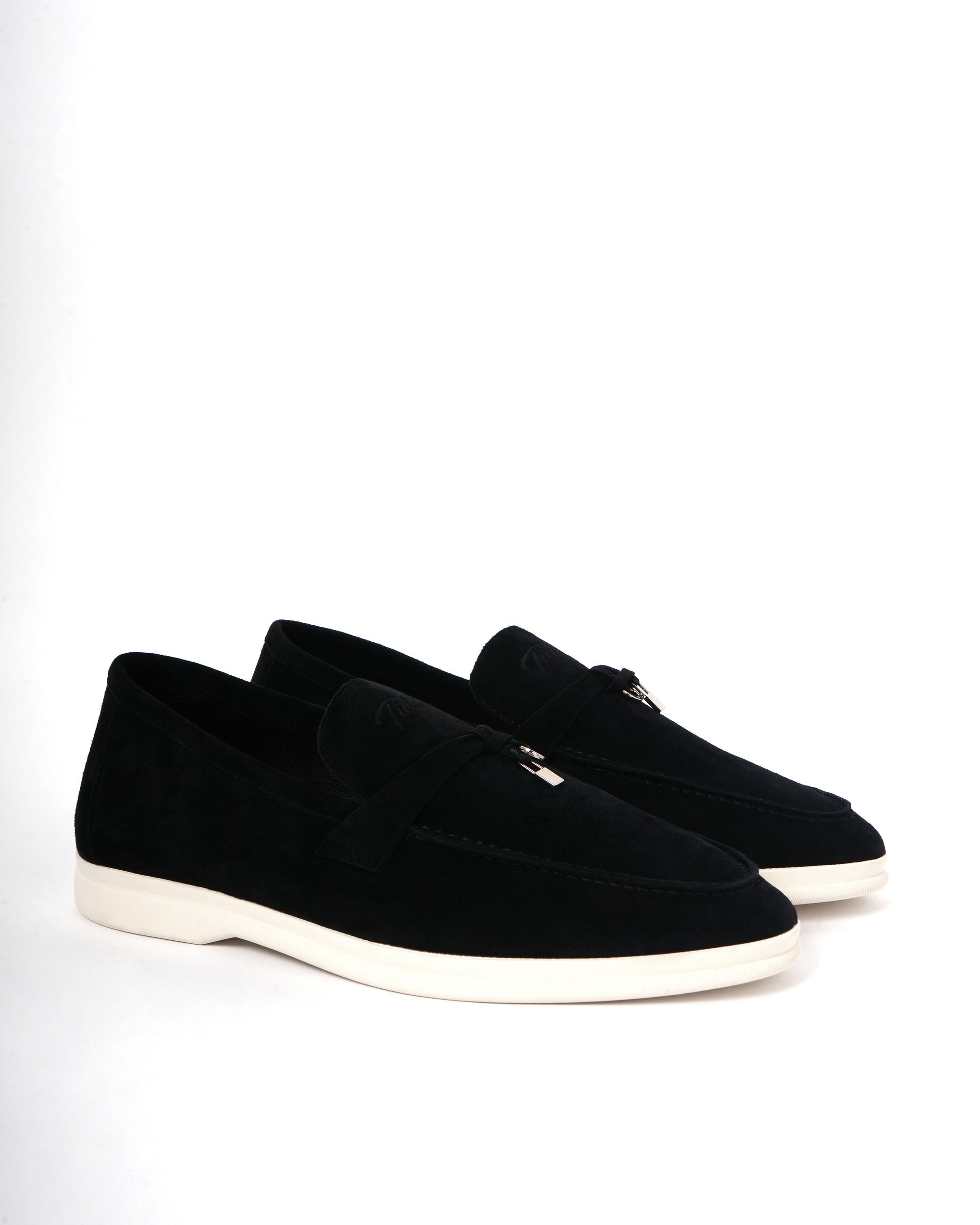
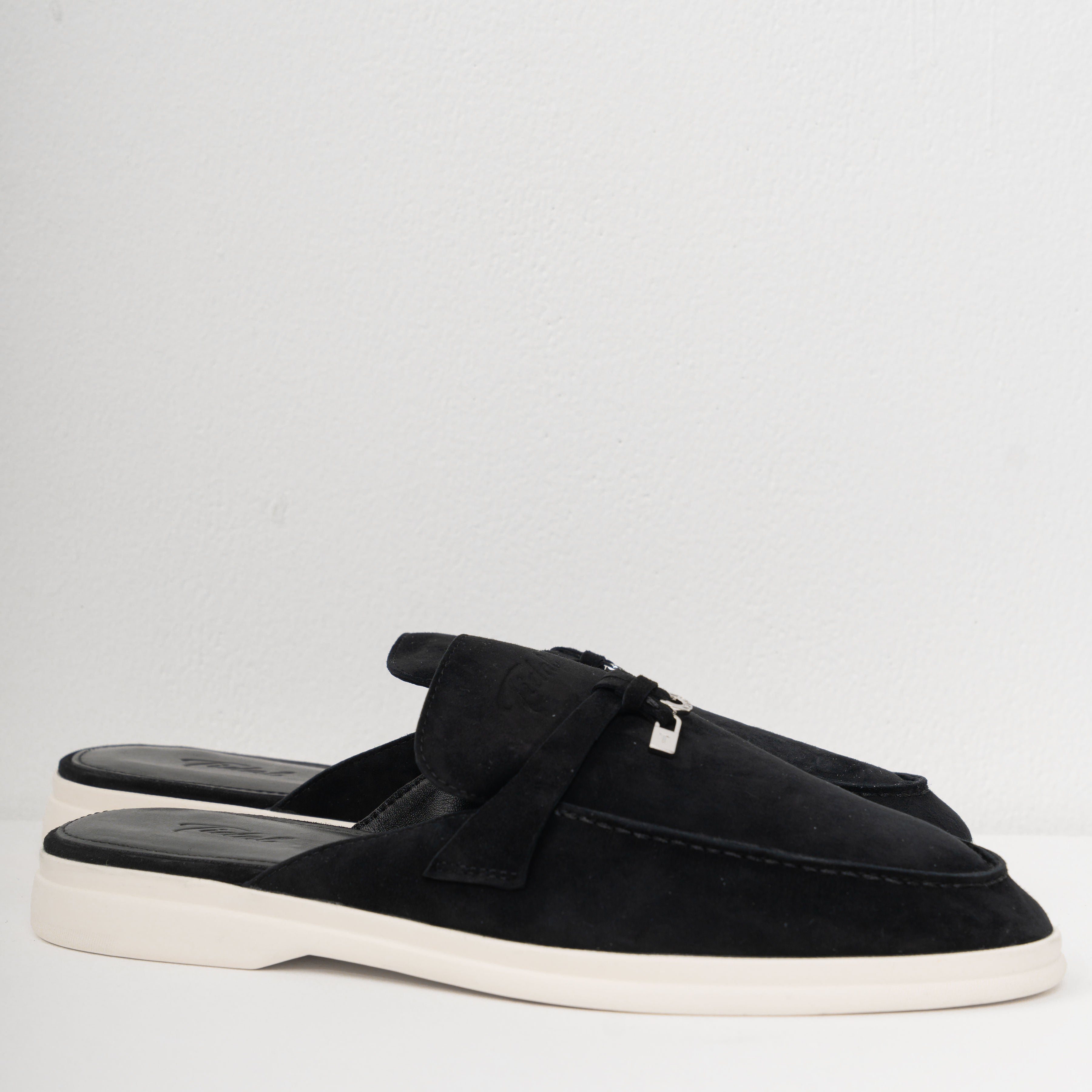
Signature pair
Sovrano — Black
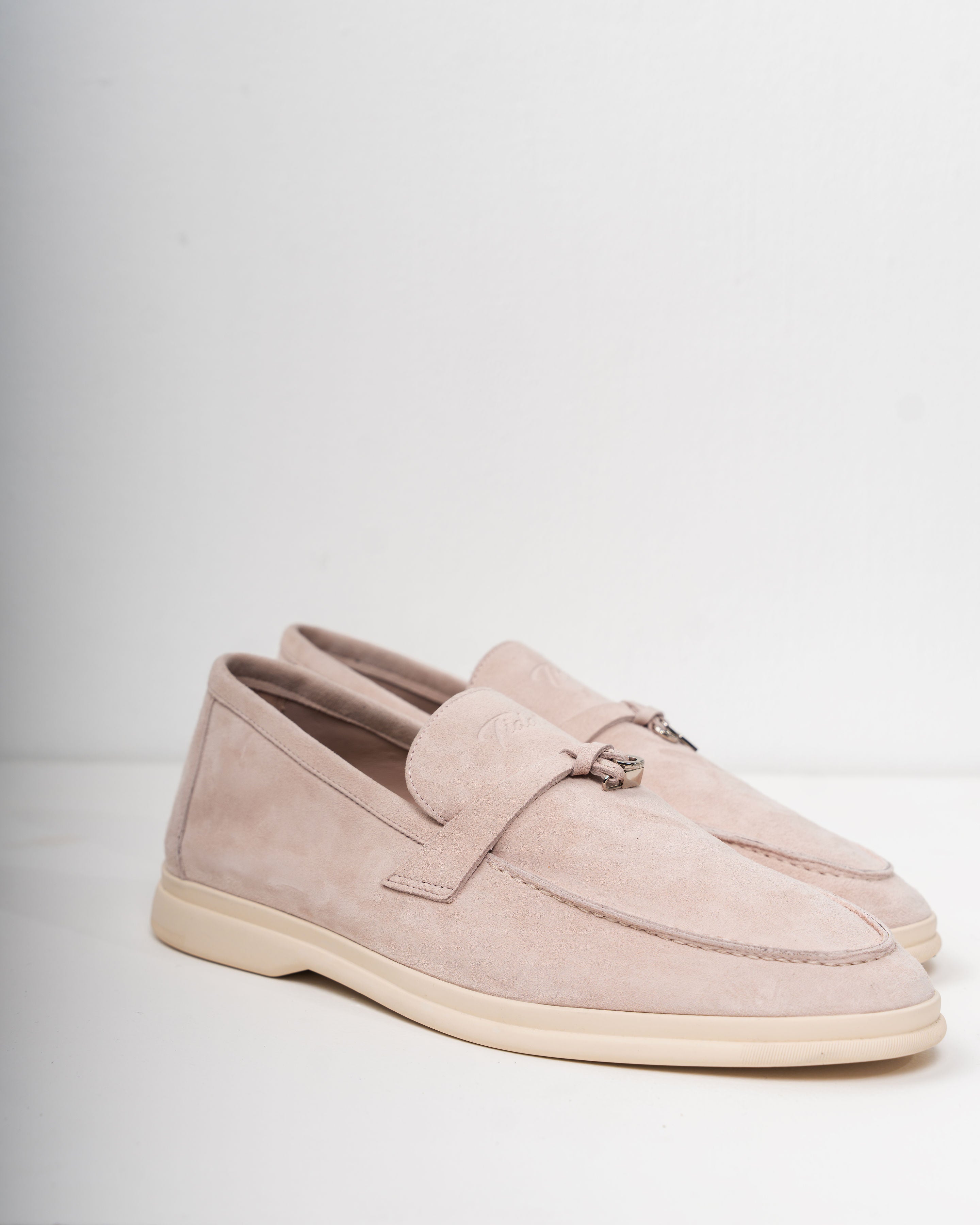
Women's house last
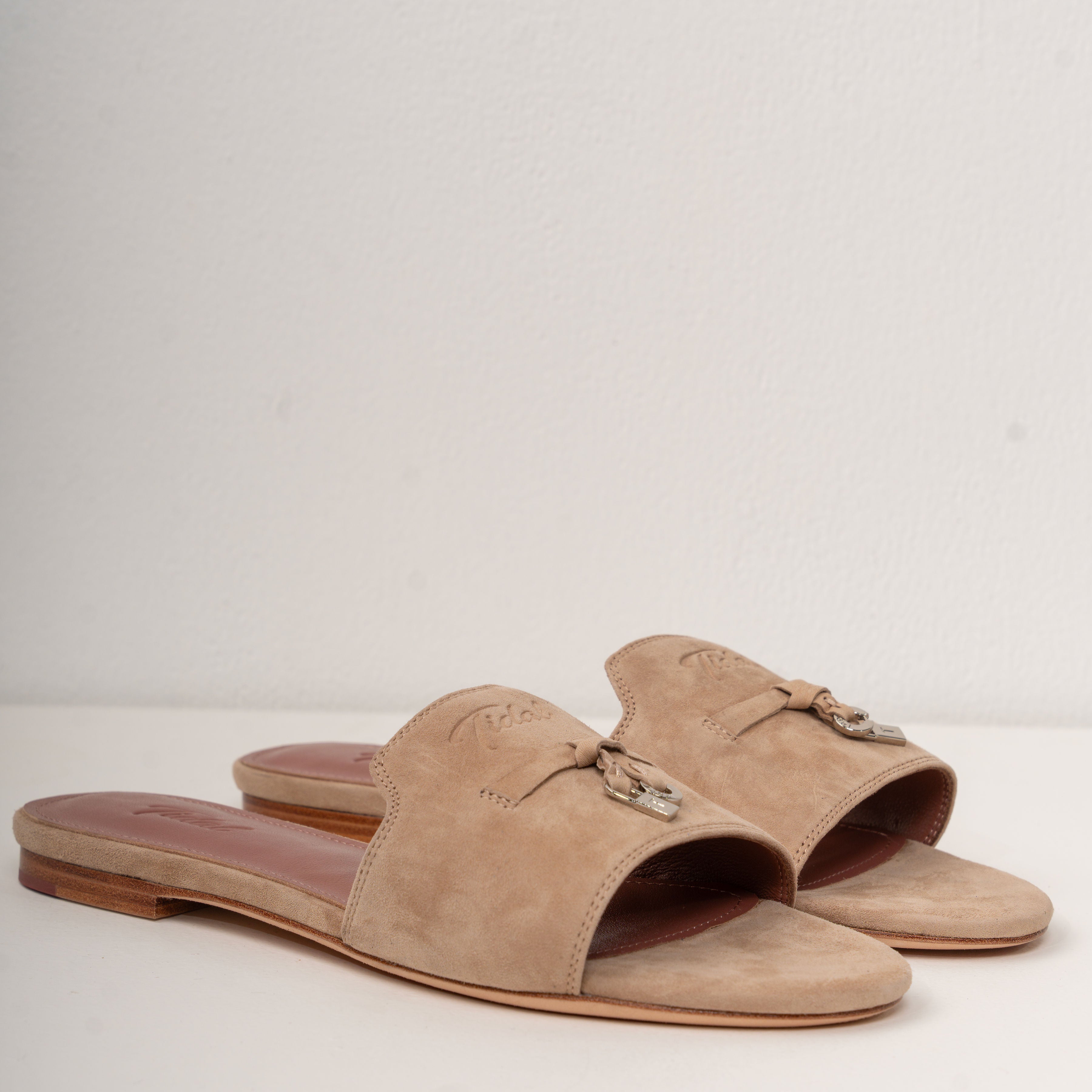
Sovrana — Beige
Ready to wear
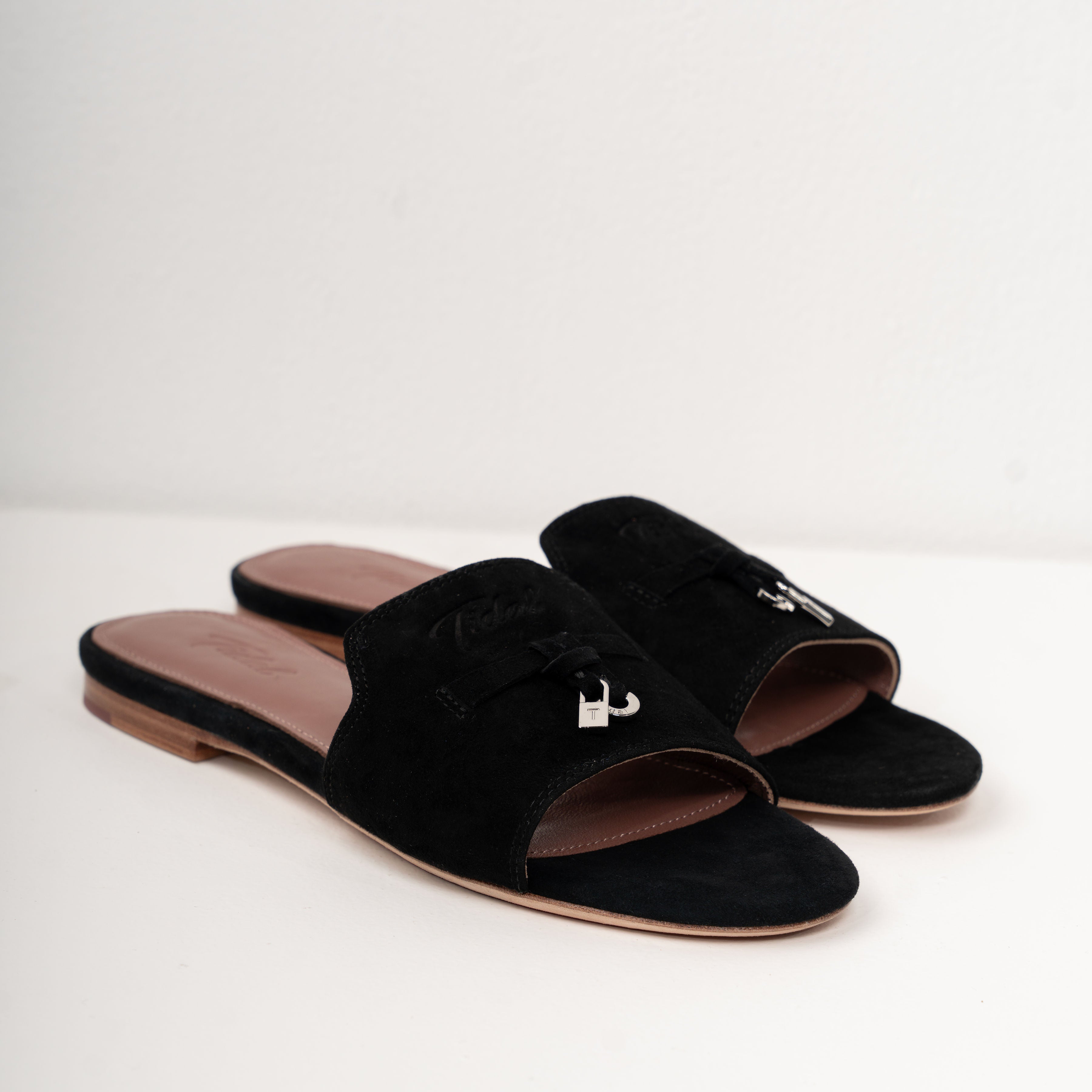
The Slipper
An entire category of its own: leather-lined, collapsible heel, cut on the same last as the loafer.
Shop slippers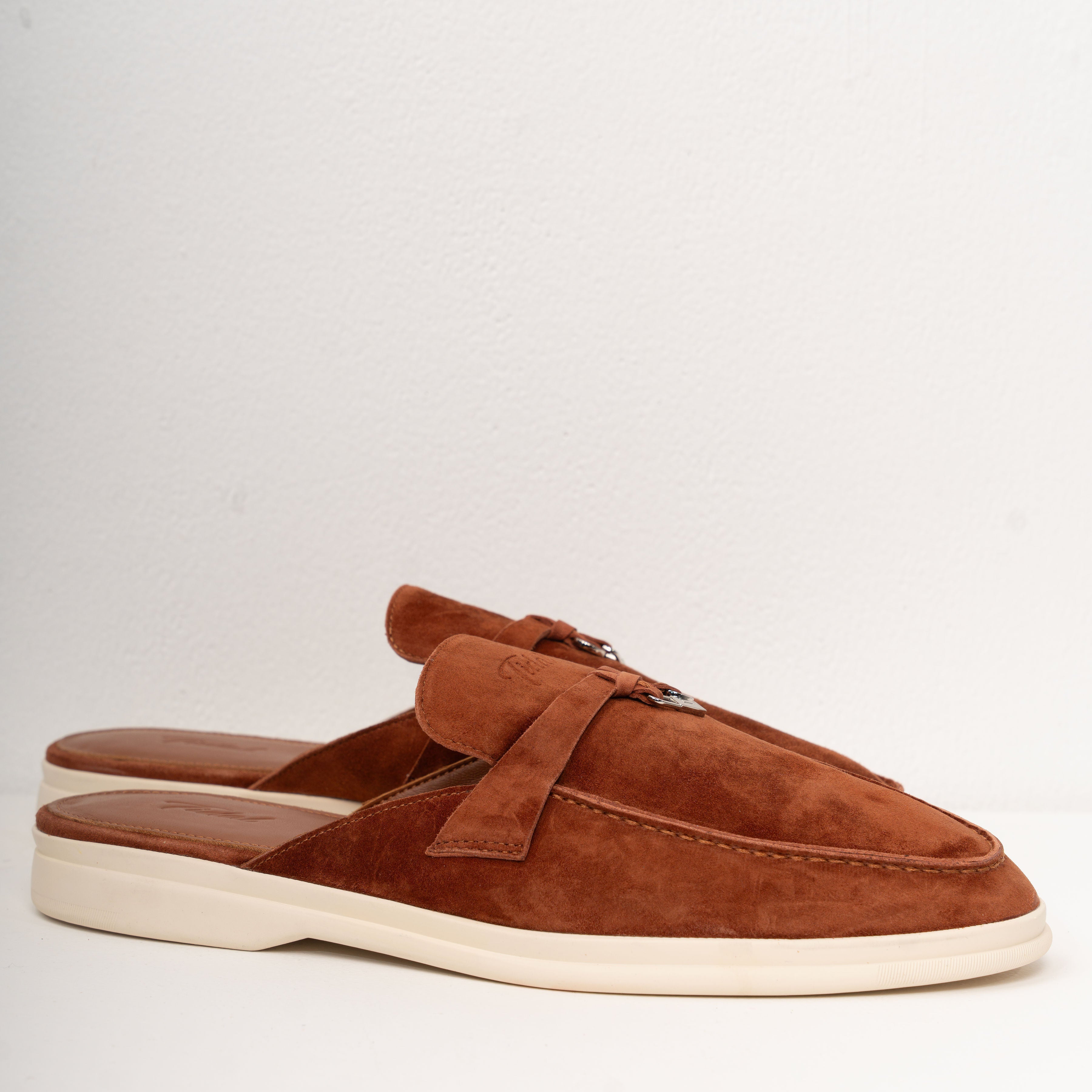
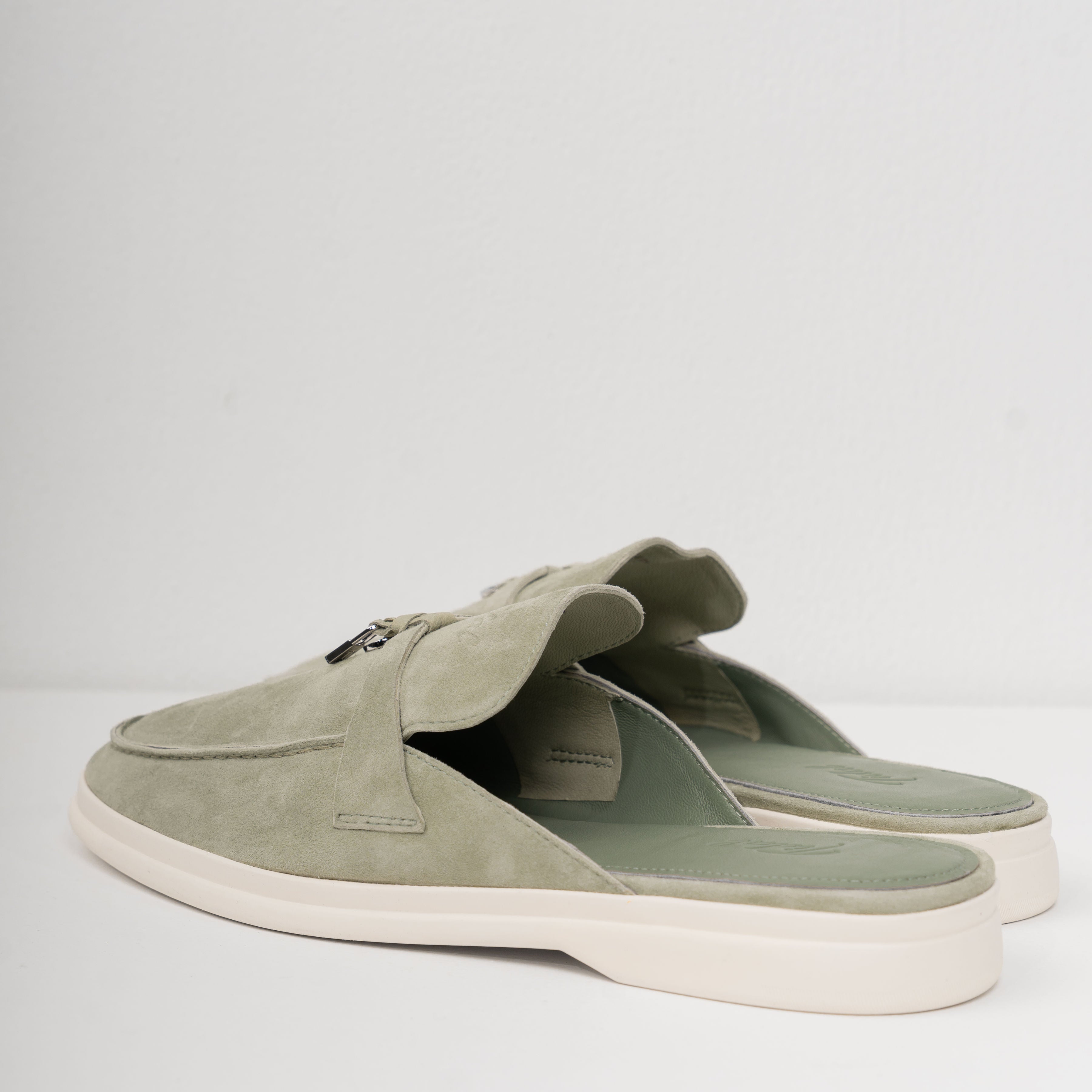
Why Tidal
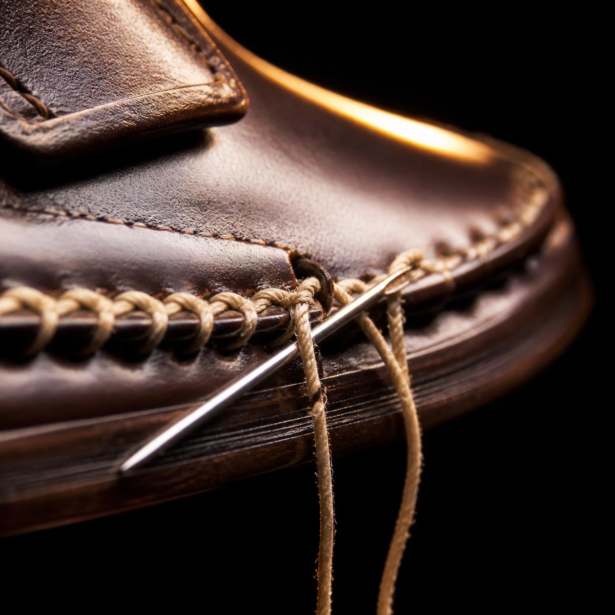
A new house has to earn the price out loud.
Tidal is made for Dubai and sold direct, with no wholesale margin and no seasonal churn. That is the whole reason a pair sits at AED 1,500–1,800 instead of the AED 4,000 a comparable construction carries in a mall. We would rather show you the welt, the last and the return policy than a logo.
Direct only
No resellers, no markups
Made small
Batch runs, then retired
Repairable
Resoled, not replaced
Watch a pair being lasted, cut and closed.
Fit confidence
Order one size. Keep the one that fits.
- True to size for most feet; we advise half a size down for narrow.
- Men 39–46, women 35–42 — the slipper shares the loafer last.
- Free exchange within 30 days, collection arranged in the UAE.
- WhatsApp a photo of your current shoe and we will size you.
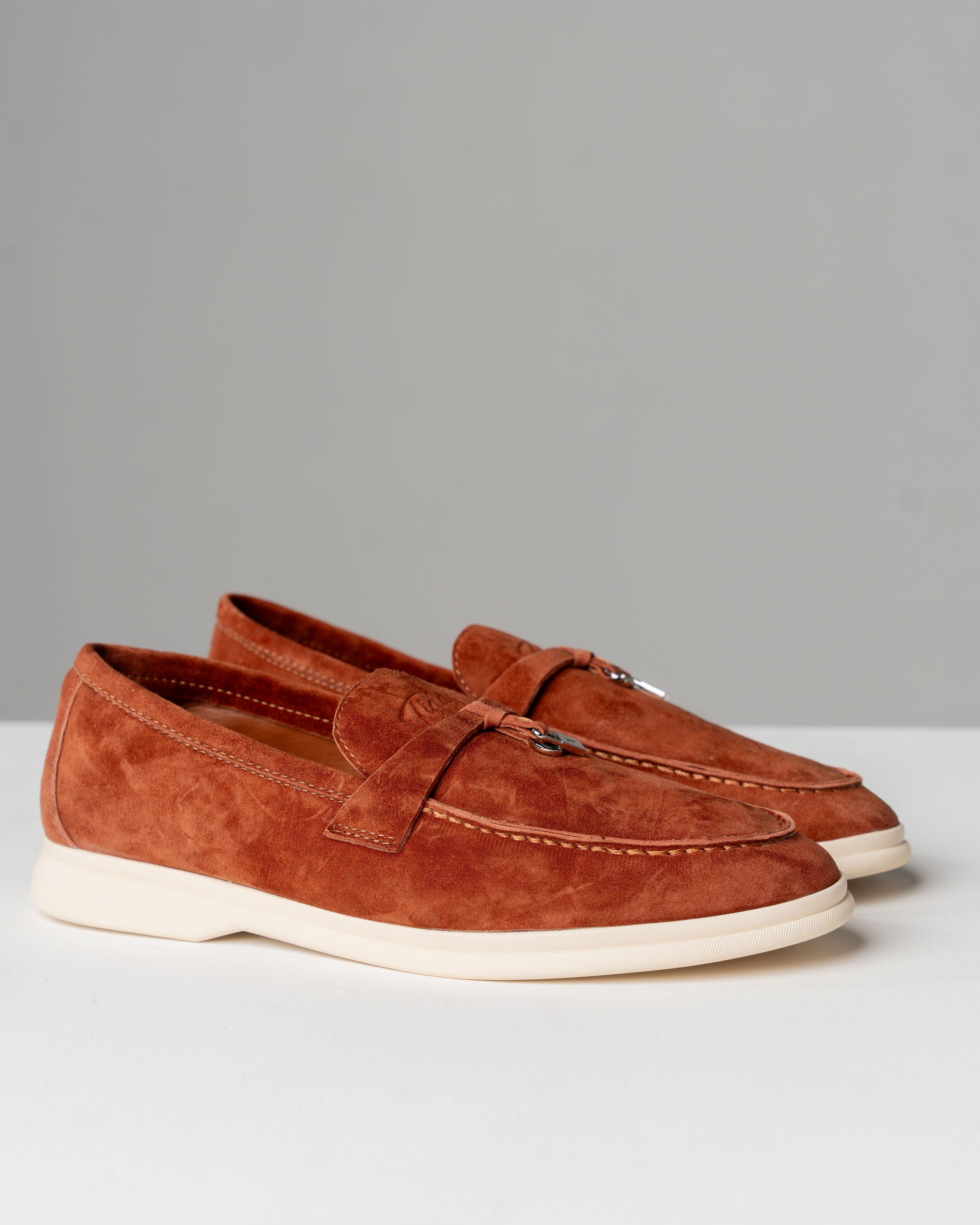
The Tidal Experience
“Softer than anything I own, and I wear them daily.”
“The finish reads like pairs at twice the price.”
“Exchanged a size in two days, no questions asked.”
Join the house
First access to each limited run.
Colourways are made in small quantities and retired. Members are notified before a release goes public.